Project Overview
Shine Bright Perimeters is a local cleaning business led by someone who takes her work seriously. She came to me needing a visual identity that looked as clean and reliable as the service she provides. It had to feel professional and approachable at the same time, with enough flexibility to connect with homeowners, realtors, and small office clients.
Shine Bright Perimeters is a local cleaning business led by someone who takes her work seriously. She came to me needing a visual identity that looked as clean and reliable as the service she provides. It had to feel professional and approachable at the same time, with enough flexibility to connect with homeowners, realtors, and small office clients.
Concept Development
From the start, the goal was to keep things honest. I didn’t want to overdesign or force symbolism where it wasn’t needed. The name already says something strong. I explored a few directions, but most of them either felt too stiff or too playful. The one that stuck was built around a cursive wordmark, soft sparkles, and a muted pastel palette. It gave the brand a personal tone that still felt capable and consistent.
From the start, the goal was to keep things honest. I didn’t want to overdesign or force symbolism where it wasn’t needed. The name already says something strong. I explored a few directions, but most of them either felt too stiff or too playful. The one that stuck was built around a cursive wordmark, soft sparkles, and a muted pastel palette. It gave the brand a personal tone that still felt capable and consistent.

Logo Design and Visual Elements
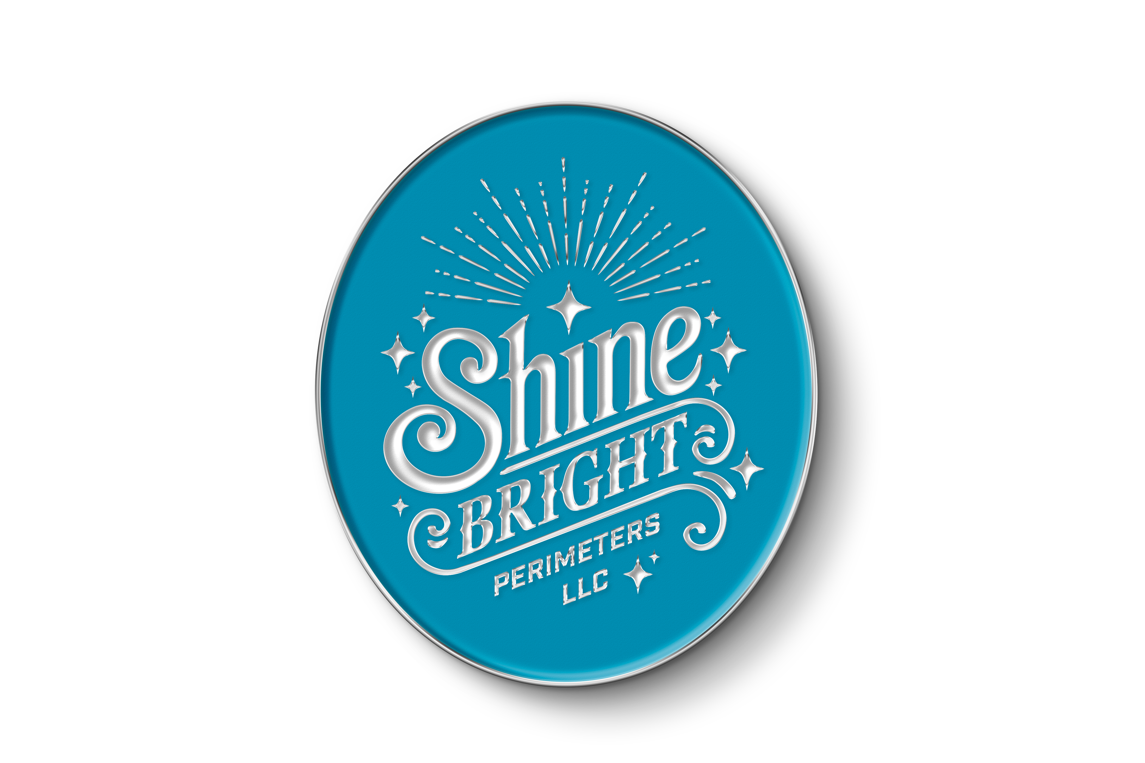
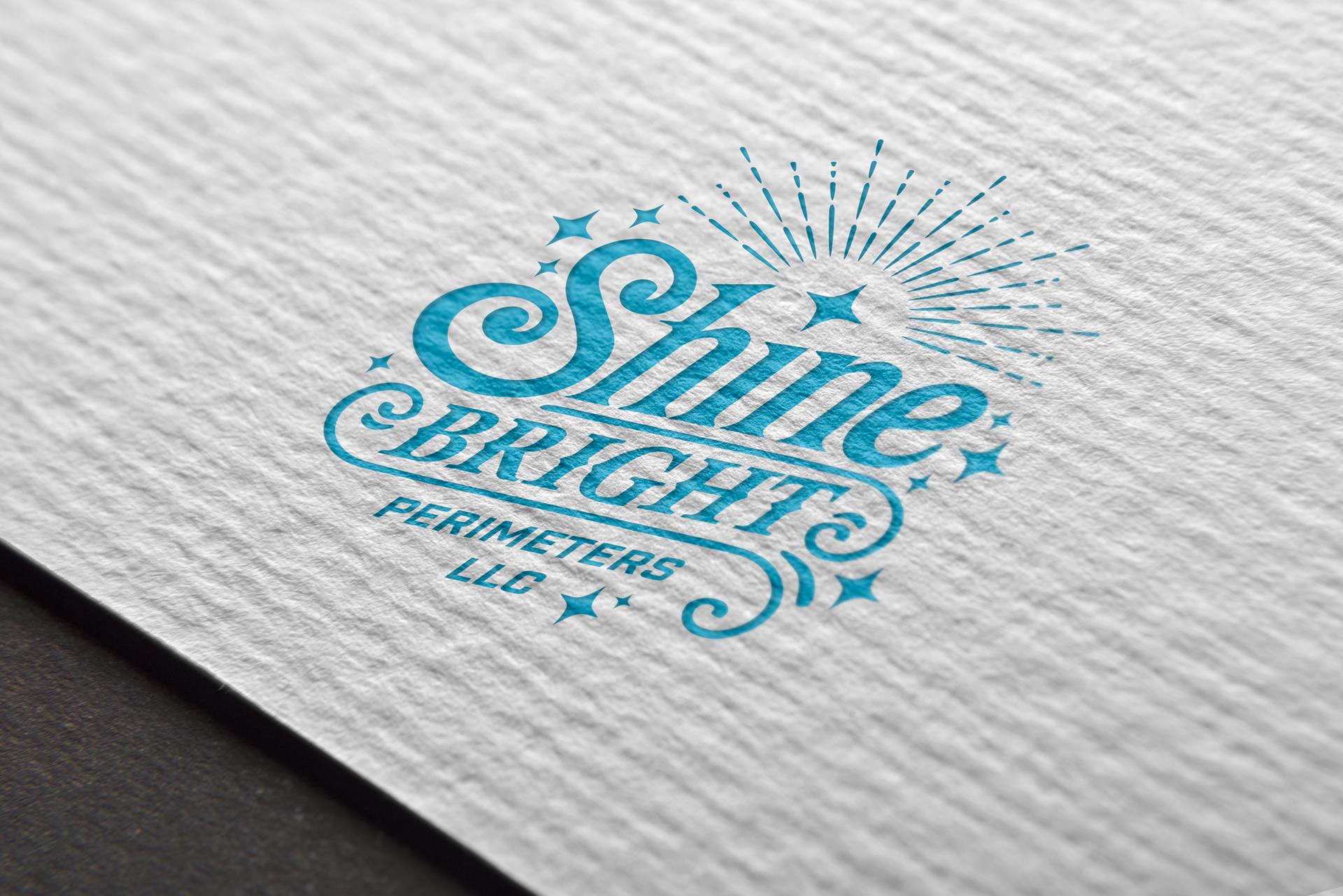
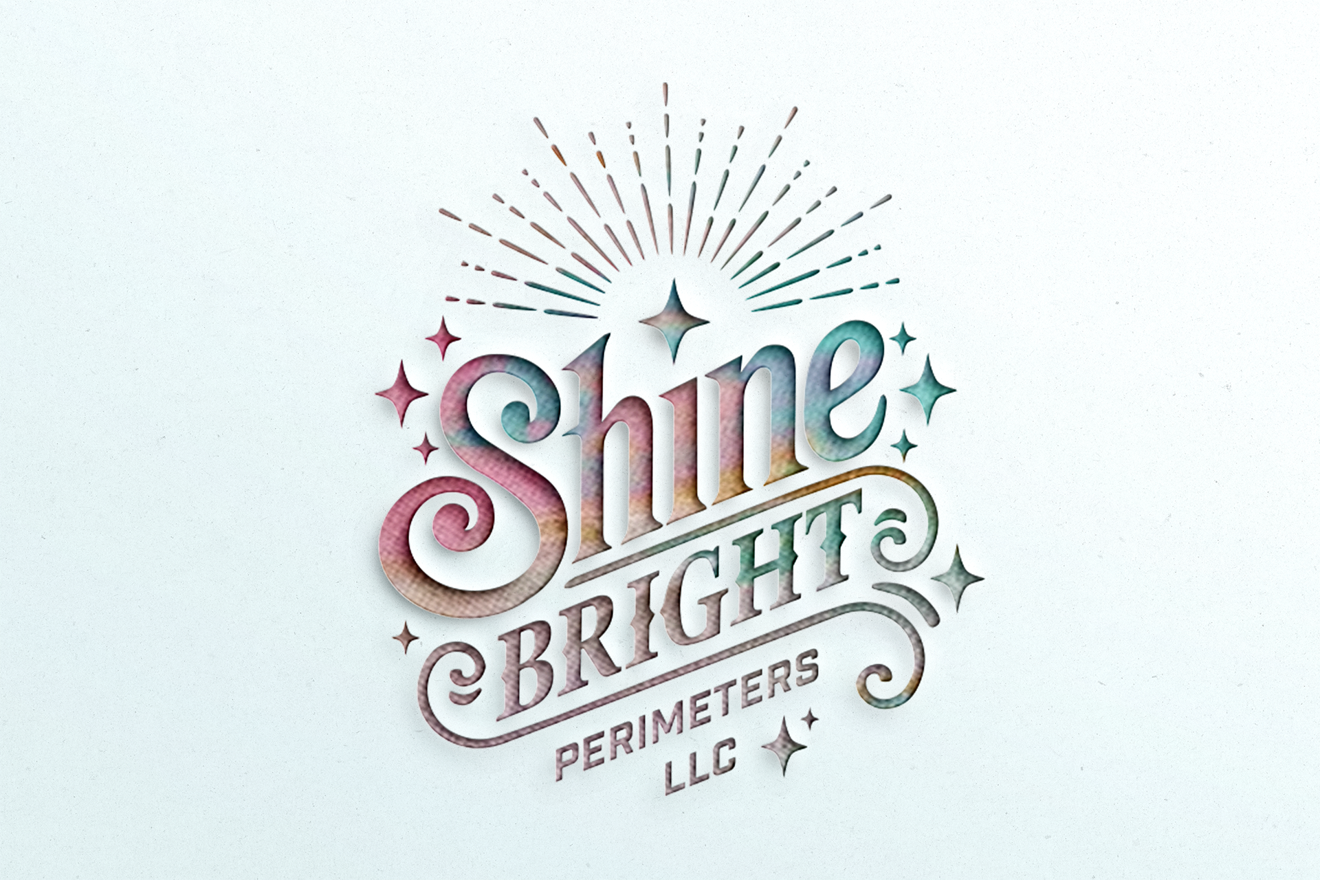
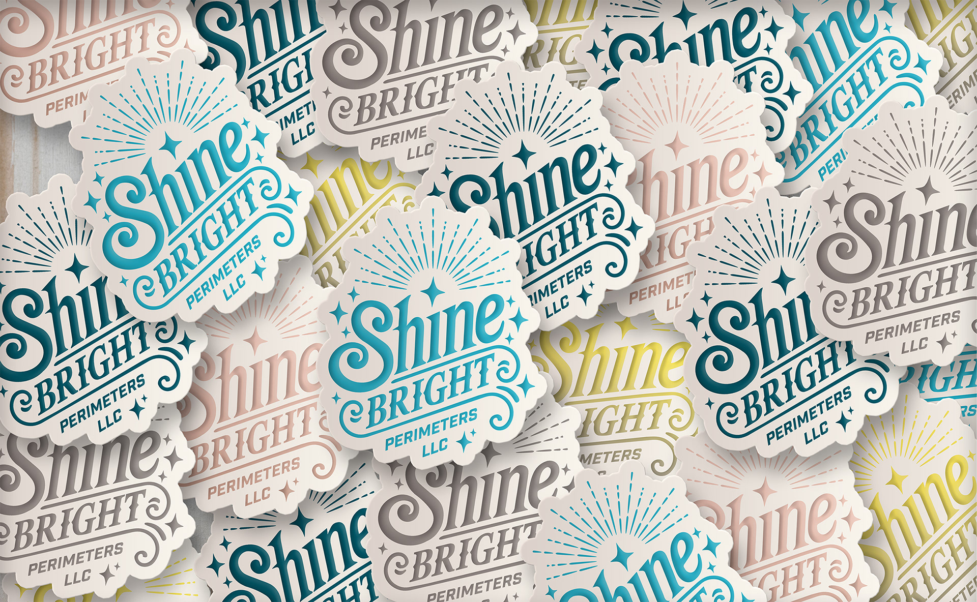
This logo needed to carry across a lot of different uses without falling apart. It had to hold up on business cards, vehicle decals, and social posts without losing clarity. The final mark kept things simple, with subtle details that pointed back to the name. The sparkles are quiet, but they do enough to reinforce the promise behind the brand. The color choices help it feel calm, clear, and easy to trust.
This logo needed to carry across a lot of different uses without falling apart. It had to hold up on business cards, vehicle decals, and social posts without losing clarity. The final mark kept things simple, with subtle details that pointed back to the name. The sparkles are quiet, but they do enough to reinforce the promise behind the brand. The color choices help it feel calm, clear, and easy to trust.
Typography and Color Palette
The type needed to balance warmth and function. The cursive logotype brings personality without losing legibility. It pairs with clean supporting fonts for layout work in both print and digital. The color palette leans into soft pastels and neutrals, all chosen to reflect the kind of environment she creates through her work. No distractions. Just thoughtful, clear design that does its job.
The type needed to balance warmth and function. The cursive logotype brings personality without losing legibility. It pairs with clean supporting fonts for layout work in both print and digital. The color palette leans into soft pastels and neutrals, all chosen to reflect the kind of environment she creates through her work. No distractions. Just thoughtful, clear design that does its job.


Deliverables
Along with the logo, I put together a full brand visual guide. It covers how to use the identity across different formats, making sure everything stays consistent and professional wherever it shows up. I also created mockups for print materials and social assets to help the client see how the system works in real-world settings.
Along with the logo, I put together a full brand visual guide. It covers how to use the identity across different formats, making sure everything stays consistent and professional wherever it shows up. I also created mockups for print materials and social assets to help the client see how the system works in real-world settings.
This was a solid project to be part of. The final identity gives Shine Bright Perimeters a strong, clear foundation to grow from.